Beyond Reference Management
Elevating Mendeley's Homepage for today’s researchers.
Mendeley streamlines your research with a comprehensive suite that manages references, enhances knowledge, and facilitates collaboration, simplifying the journey from writing to publication.
The strategic redesign of mendeley.com, was led with the aim to modernise the interface and effectively communicate its value proposition to researchers worldwide. Key objectives included enhancing user experience, updating branding elements, and optimising content delivery.
ROLE
UX Designer
COLLABORATORS
Developers
Marketing Lead
Senior Product Director
Product Managers
Analytics team
TIMELINE
July - December 2022
RESPONSIBILITIES
Planning
User Research
Design workshops
Interaction Design
Visual Design
Prototyping
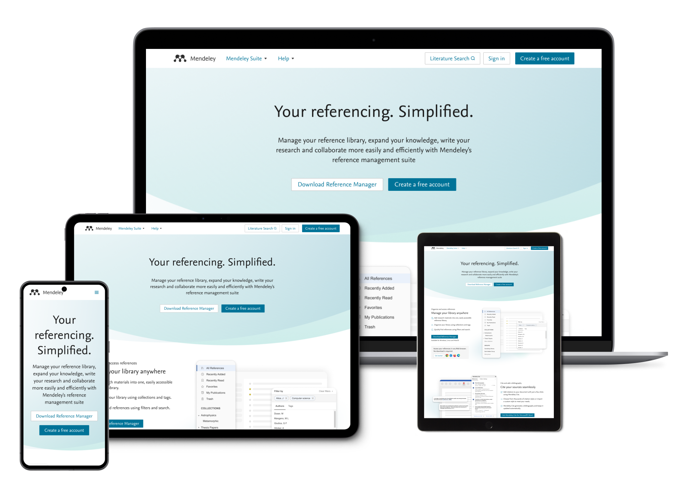
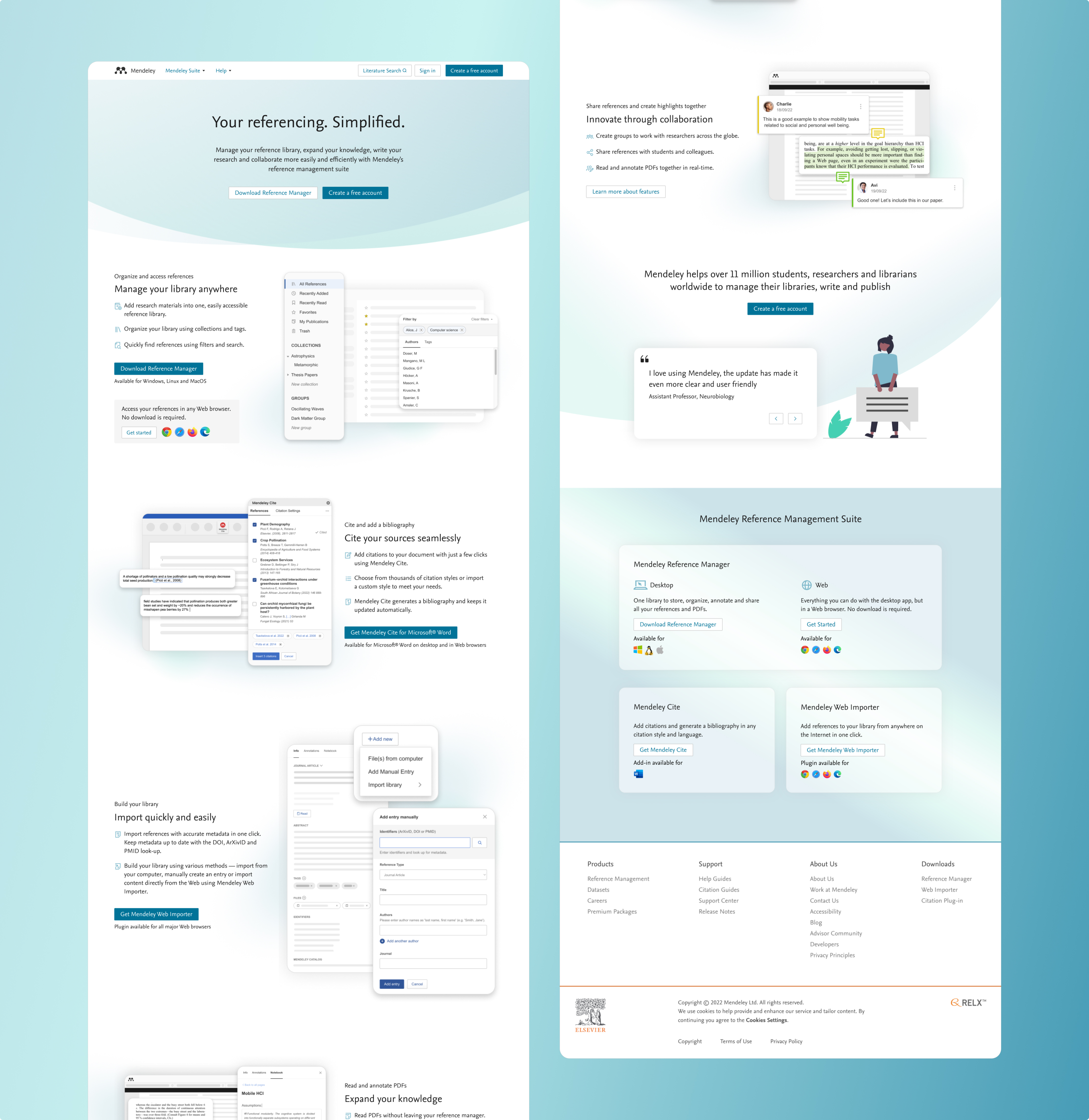
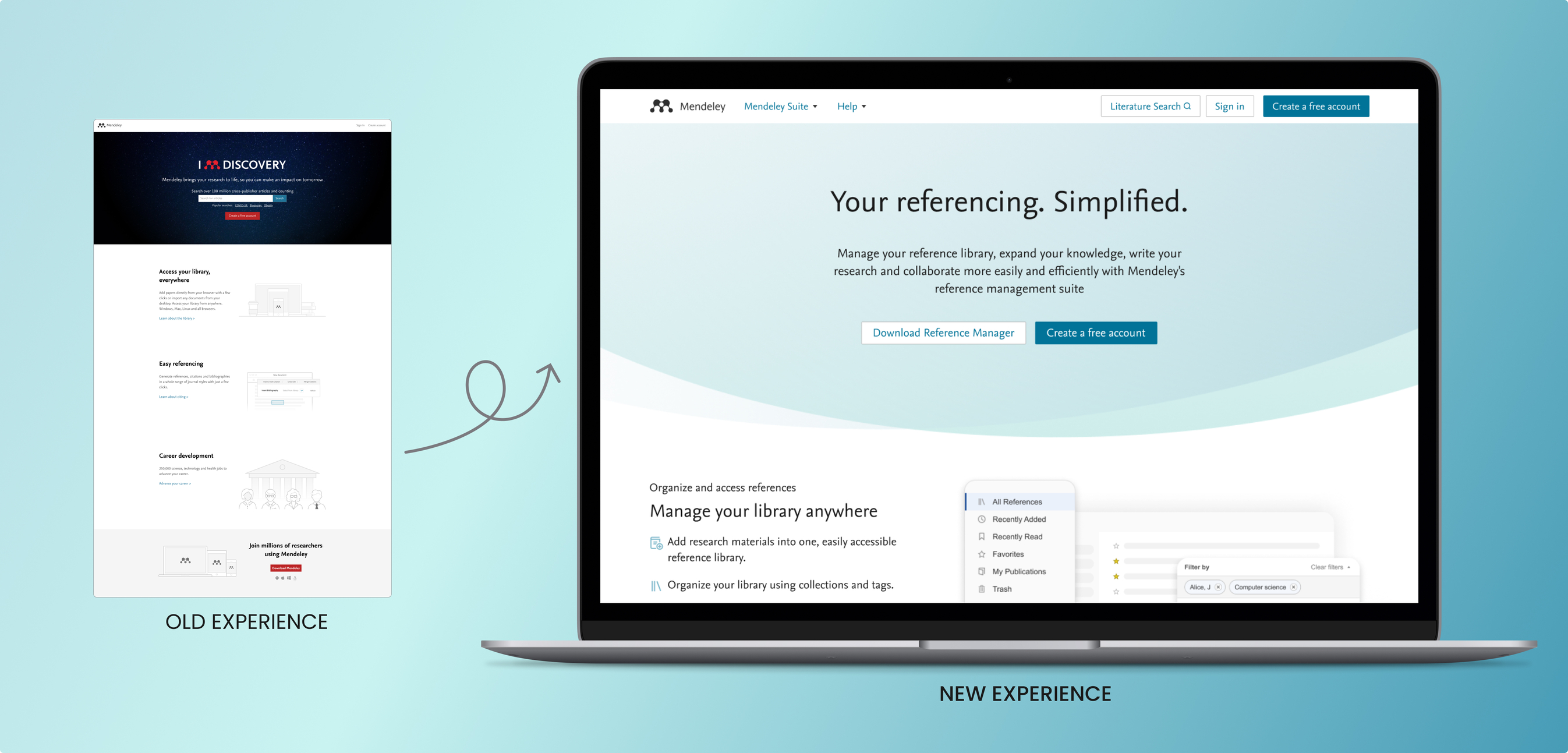
The new home page experience
KEY RESULTS
Content Engagement
4.5 / 5
Perception of Trust
4.4 / 5
Content Clarity
4.5 / 5
These are pre-launch metrics from qual and quant testing.
Defining the problem
Why Mendeley's Full Potential Remains Hidden?
The user research at Mendeley has shown that while the reference manager is widely used for managing and organising research, users often turn to other platforms for additional needs. This indicates a significant gap in awareness regarding Mendeley’s comprehensive features, including the web importer, reader, and the MCite tool for writing and citing references, as well as Groups for collaborative work.
Many users recognised Mendeley only as a reference manager, overlooking its full suite of research tools and collaborative features.
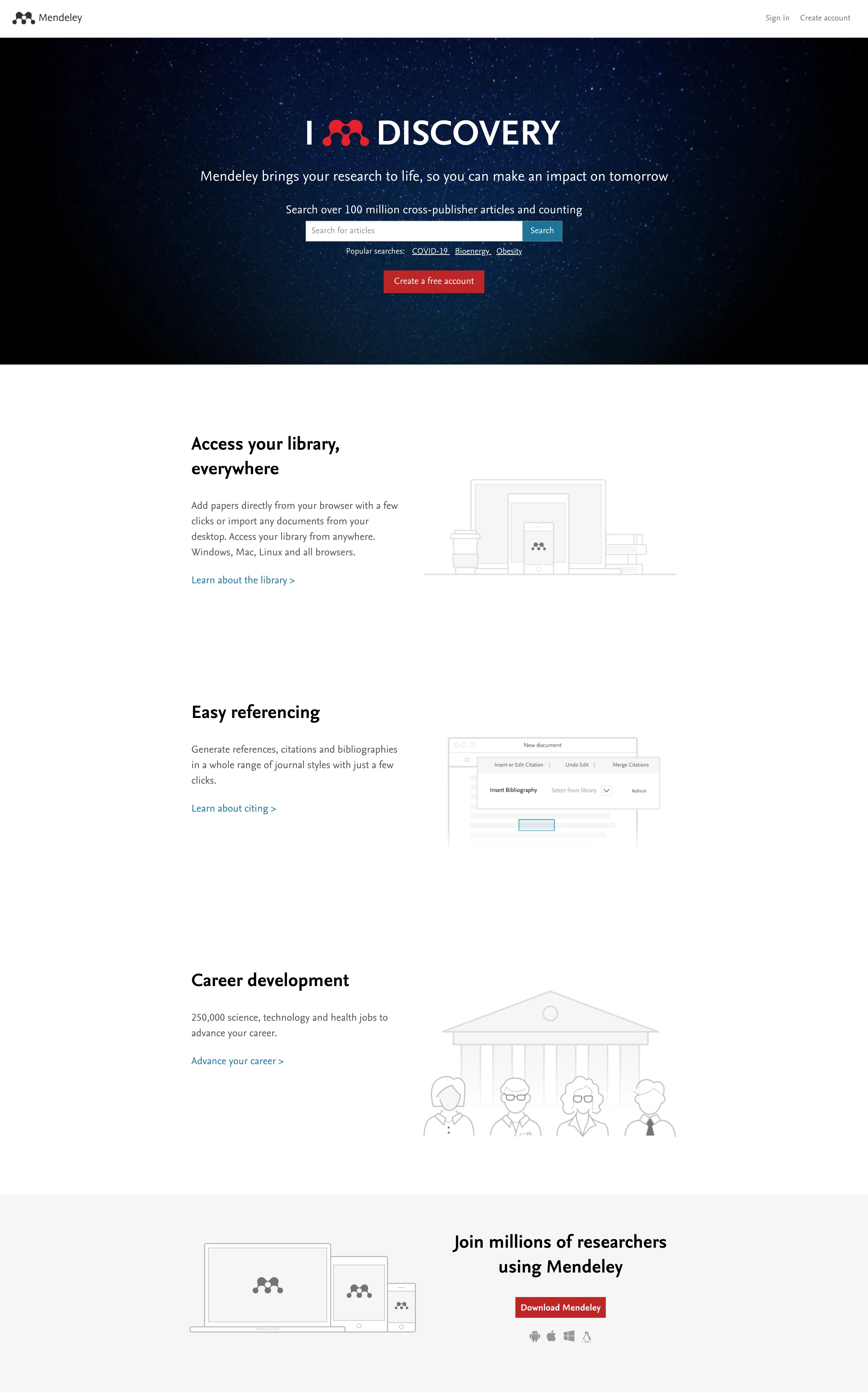
Mendeley's previous branding did not reflect its modern vision and capabilities.
Several sections, including the careers page, were outdated and no longer relevant, highlighting the need for immediate updates to maintain our site's relevance and accuracy.
Project Goals
Defining the New Value Proposition
In a collaborative workshop with key stakeholders from the business, product, marketing, analytics, and development, I plotted, prioritised and defined critical focus areas for new Mendeley home page.
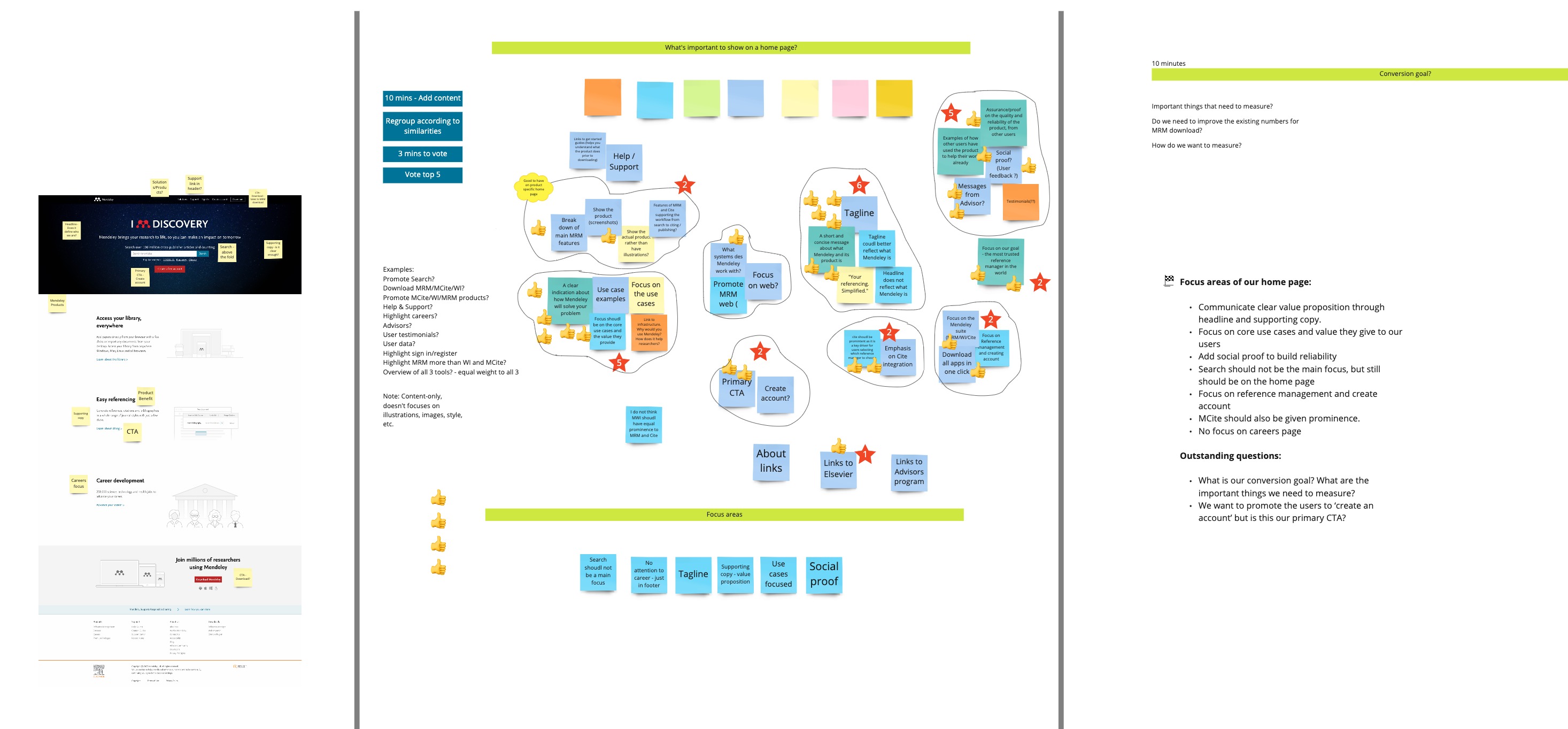
Workshop Outcome
The workshop helped us to define the clear goals for the project
 Redefine brand presence
Elevate Mendeley’s brand by adopting a fresh, modern visual identity that aligns with its core values and appeals to the audience.
 Reinforce Trust
Highlight Mendeley's capabilities to support researchers throughout their research journey, enhancing user trust and reliability.
 Content Clarity
Revamp content to reflect Mendeley's modernised brand image, ensuring clarity and alignment with our updated brand values.
 Make it engaging
Communicate how Mendeley supports researchers throughout their entire research journey.
Concept testing
Testing the Waters
I translated conceptual ideas into tangible prototypes and validated them through comprehensive user research comprising of qual and quant methods.
The objectives were to assess the clarity of Mendeley's value proposition, evaluate trust in the brand and user engagement with the product, and analyse the discoverability and findability of the content.

Understanding discoverability and findability
Using the first-click test, I discovered that nearly 30% of users struggled to find what they were looking for.
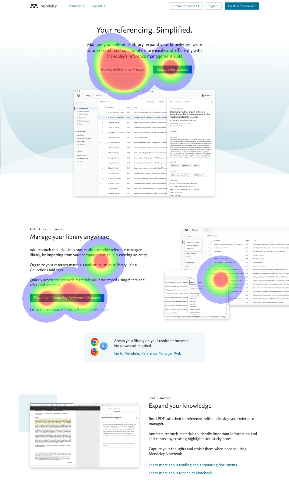
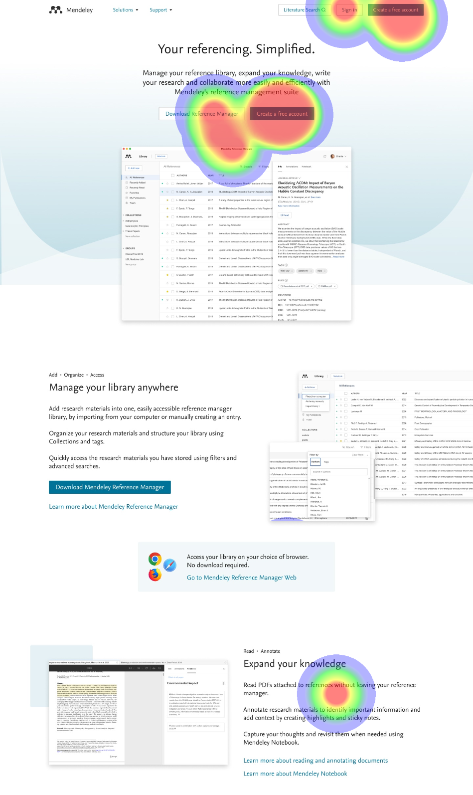
Testing Outcome
Highlights
⭐What Went Well
Content Clarity
90%
Participants found the content clear and easily understood Mendeley's new value proposition.
Ease of Navigation
75%
Participants were able to locate content easily, including primary CTAs and navigation links.
Content Engagement
96%
Participants found the content engaging; images next to the use cases grabbed their attention and enhanced their understanding.
📈What Could Be Improved
Lack of Scrolling
70%
Participants did not scroll unless prompted, assuming there was no additional content below the fold.
Confusing Labels
30%
Participants were confused between 'Support' and 'Solutions' in the header, finding them too similar in purpose.
Unclear Images
40%
Participants focused heavily on images and were frustrated by unclear details.
Missed Secondary CTAs
60%
Participants missed the secondary CTAs as they were not visually distinguishable.
Designing Solution
Sailing to Solutions
I synthesised the results from our research and addressed the issues highlighted during the process. Based on these insights, I crafted the following designs.
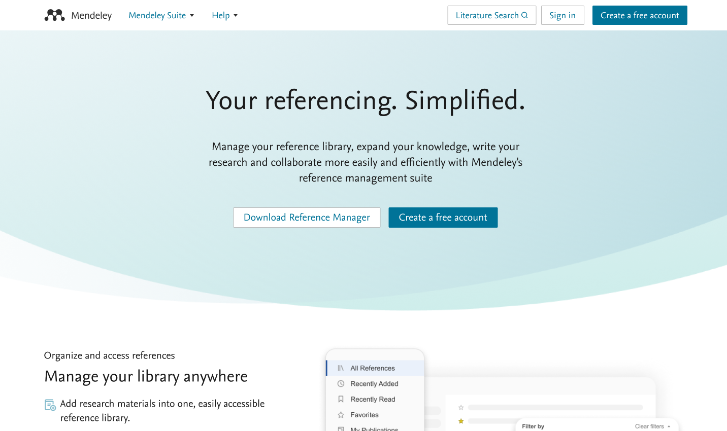
The visibility of content below the hero area encouraged the users to scroll.
The replacement of "Solutions" with "Mendeley Suite" helped to remove confusion between with the "Support" section.
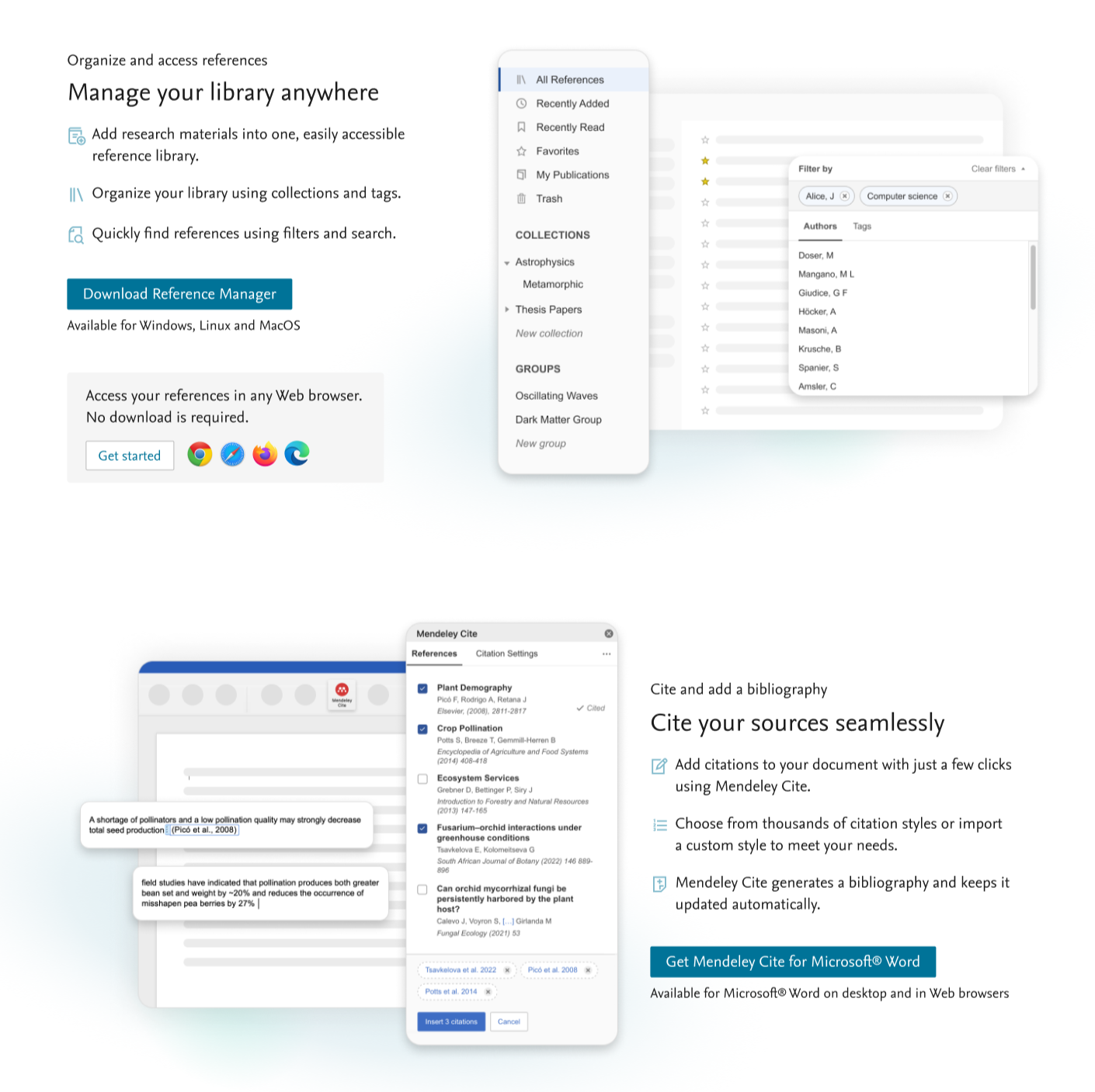
The imagery was clear and less cluttered and received a positive feedback.
The CTAs were made bold and visible, with secondary actions given less visual weight.
A Fresh, Modern Look that Reflects Our Brand Values
Key Learnings
Early and Iterative Feedback
By incorporating user feedback early in the design process during the concept testing phase, we were able to gather valuable insights that shaped the direction and effectiveness of our design solutions.
Critical Role of Team Communication
Effective and ongoing communication was crucial for the project's success. By keeping communication channels open, we aligned our goals, understood each team's challenges, and ensured unity. This approach streamlined our workflow, reduced misunderstandings, and minimised delays throughout the project lifecycle.